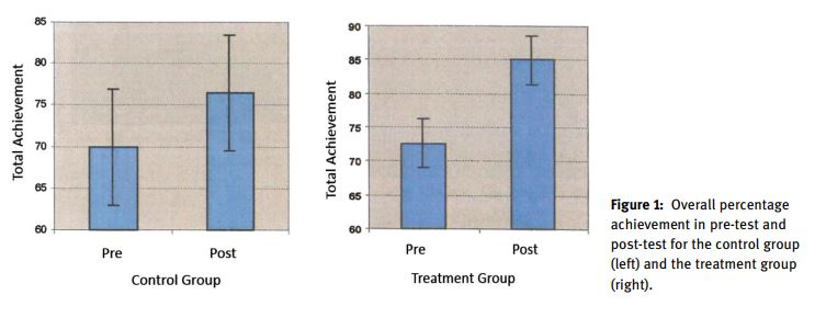
I have been working on a meta-analysis project and ran into an annoying but all-too-common situation for meta-analysts. A few of the papers eligible for my project report very few summary or inferential statistics in the text or tables. Instead, results are reported in bar charts with means and standard errors. It is easy enough to eyeball values and get approximately correct figures, but values obtained in this way are difficult to reproduce. Below are two examples of such graphs.

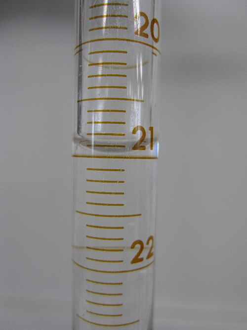
Back in my CHEM 101 days, I learned a couple important concepts in scientific measurement. First, decide upon a method or technique and stick to it. For example, when measuring out liquid in graduated cylinders chemists always spot values at the bottom of the meniscus rather than the top. Second, it is important to have some understanding of how precise you can be while maintaining accuracy and reproducibility. Reading down to 0.01mL on a graduate cylinder marked off in 0.1mL increments is probably not justifiable, but reading it to the nearest 0.05mL probably is.
Eyeballing values off a chart without a clear method is like taking scientific measurements with a common measuring cup. One can improve the measurement by taking additional steps (like overfilling, then scraping off the excess with knife) but these steps make an already time-consuming process more time consuming. Likewise, graphs and charts can be carefully annotated in common software, but this is cumbersome and imprecise. What is needed is a software tool that minimizes effort and leads to reproducible values.
Tools for Data Extraction
Different software tools exist that can digitize graphs. Some of these can automatically detect and extract data from uploaded images, returning slopes off a line graph, or a the cooridinates of all points on a scatterplot. The following are just those that I have tried to use:
- Plot Digitizer
metagearjuicrmetaDigitiseandshinyDigitise
Plot Digitzer has been around for some time and can be downloaded as a free, standalone application. If I were to to use Plot Digitizer I would probably use the online app version which has a better GUI and allows for different chart types to be selected. Unfortunately, the most useful features are kept for a paid version (at least its not a subscription). The free version simply allows coordinates to be selected and exported.
The other three are R packages. metagear has several functions to facilitate systematic reviews and meta-analyses a few of which automatically extract data from select plot types (LajFacilitatingSystematicReviews2016?). These functions take the plot as an argument (it’s file path that is) and returns a dataframe with the detected data points. Unfortunately, this automatic data extraction has not worked for me in the few cases that I attempted. The defaults of the function can be changed to account for variations in plot style and quality, but after a couple hours of fiddling, I couldn’t make it work for me. Also, it hasn’t been updated since 2021 (as of May 2024) and it is unclear when it will receive improvements.
juicr is an extension to the data extraction functions in metagear which adds a GUI and enables semi-automated functionality (INN+AdviceImprovingReproducibility2023?). Unfortunately, I ran into the same issues with the automatic data extraction as I did for metagear. juicr is in beta but it is unclear when it will receive further work, especially as it seems that only one person (Marc Lajeunesse) is contributing to its development. If this package does get more attention, I will definitely revisit it for future projects.
metaDigitise and shinyDigitise
The metaDigitise R package is strictly for manual data extraction, but it provides very useful guardrails that greatly reduce the potential for user error and saves annotated plots for reproducible results. This package was introduced in 2016 and continues to be actively maintained (PNNReproducibleFlexibleHighthroughput2019?). In 2022, the package authors introduced a shiny app that provides a GUI for a better user experience (INN+AdviceImprovingReproducibility2023?).
The workflow is quite simple and begins with a function call to initialize the shiny app. In that app the user is asked to provide a folder path where plot images are kept and whether they want to edit previous extractions or extract from new plots. The steps to complete data extraction are clearly shown and the user is able to go back and change options on previous steps.
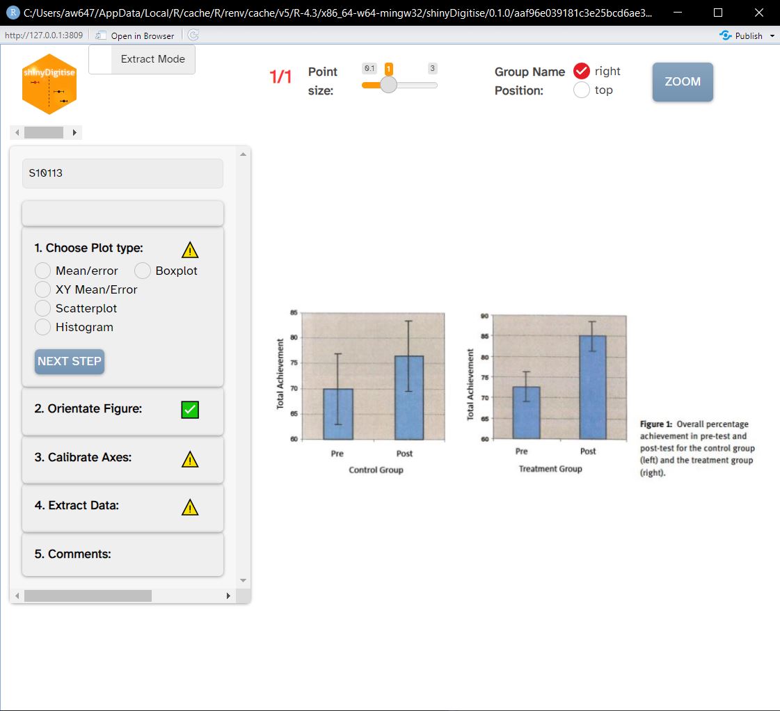
shinyDigitise GUI with a new extraction in progressData extraction requires the user to select points on the image and what values those points are associated with. The examples in this blog post are mean/error plots but shinyDigitise works with five other plot types. The end result includes an annotated version of the plot and a dataframe of extracted values along with metadata, such as the file it was extracted from

One of the quality features is that the sample sizes of groups can be inputted which allows shinyDigitise to automatically calculate standard deviation from standard errors which are more commonly plotted.
Conclusion
I hope this look at shinyDigitise and other tools for data extraction was useful Support for manual data extraction is very helpful and goes a long way towards reproducible effect size calculations for meta-analyses. I do look forward to the development of juicr and other tools that automate or semi-automate this process as this is still relatively time-intensive. My guess is that more collaborations between software developers and research synthesists are needed to develop such tools.